Branding, Logotype and Favicon for Social Media and Marketing Collateral
The Cielo Verde brand communicates light, warmth and vitality, and an attention to detail that is delivered most profoundly in its poetic dishes. Located on the rooftop of the American Visionary Museum in Baltimore, and overflowing with tropical plants, this space encompasses the guest in its warmth and generosity of spirit. Matter created this logo, color palette and brand to communicate this spirit and compliment the rich textures, flavors, and eclectic art that exists in and around this space.
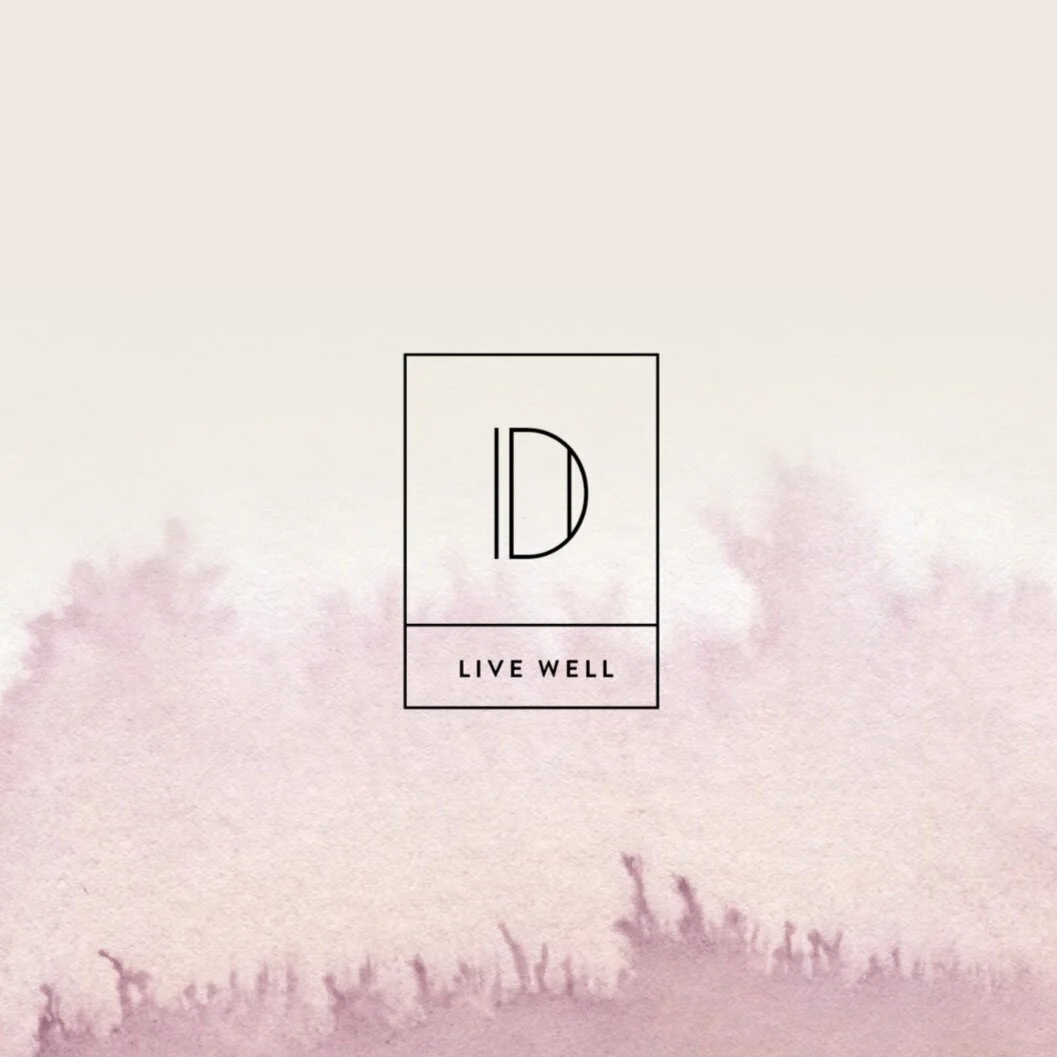
Branding for Organic Chemistry, an Organic Haircare Line
Naming, Logo, Packaging Design System, Website, Social Media Marketing, Brand Consultation
From the naming and logo to the packaging design, website, and social media strategy, we created a fully scaleable brand to launch this unique product line into professional salons nationwide. To set this line apart from other organic haircare brands, we leveraged the scientific basis on which all of their products are formulated. Every ingredient in Organic Chemistry products is there for a purpose - to benefit the long-term health of your hair and scalp. This straightforward approach and honest communication of product ingredients and benefits, paired with the company's commitment to using the cleanest, most ethically sourced ingredients is what the Organic Chemistry brand is about. Check out the new website here:
IG: @organicchemistryproducts
Branding for Flow, A Nonprofit in Baltimore City
Logo and Branding
This versatile logo was created for Flow, a nonprofit that empowers at-risk Baltimore City kids, using rap music to tell their own personal stories in a creative and powerful way. This project had two challenges - first, and foremost, to appeal to the kids and young adults that it represented. It should be wearable, identifiable and able to live in the world in a variety of formats - pictured here, etched into a wall, spray painted on a post, a pattern for a poster. Secondly, it should communicate the seriousness and viability of this endeavor to investors and donors. The logo was extremely well received by both audiences and is living a full life on t-shirts, hats, cd covers and soon to be live on their website.
Matter was tasked with developing a new brand and a 30th Anniversary logo for Art & Science Group, a consultancy group that develops strategies for higher education institutions informed by data analytics. Based on the messaging strategy - Creative Strategy at the Intersection of Art and Science - we created this brand campaign to bridge the gap between their current branding and the new brand. The 30th campaign included a revised, brighter color palette, a more confident typography system, a new logo, and new imagery style.
Matter designed this new website and content management system for Saint Vincent de Paul, in conjunction with Cohere, a branding agency based in Philadelphia. The new site made updating new programs, volunteer opportunities, and taking donations seamlessly simple and allowed SVDP to focus on its mission rather than website maintenance and glitches. The template for this site was so successful that other branches of SVDP adopted it for their own. Visit the full site here.
Branding, Logo Design, Look Boards
This brand was created in partnership with Cohere, a Philadelphia branding agency, for an apartment development project in downtown Baltimore. This project is the living component to a larger development effort to revitalize what was once Baltimore’s Chinatown and bring food and street presence to this historically rich neighborhood. The apartment building was thoughtfully considered to attract young professionals in Baltimore and Washington DC, graduate students from the University of Maryland, and anyone who enjoys urban living with walkable amenities and a sensibility for modern design details.
Website and Branding for SmartLiving 360
Branding, Copywriting, Messaging, Brand Consultation, Web Design, Development and Strategy
SmartLiving 360 is an innovative business taking on the future of senior housing, healthcare and wellness as a movement for change. They came to us for guidance on repositioning and rebranding the entire enterprise to leverage their expertise in many different aspects of the field of longevity. Matter suggested bringing all three arms of the business - Consulting, Development and Thought Leadership - under one umbrella brand, SmartLiving 360. Using animated infographics, interactive case studies, a bold, inviting color palette and strategic messaging, the website and branding work to engage a wide audience - including potential residents, development partners, media opportunities and consulting businesses - to help visitors find information (and inspiration) in SmartLiving 360’s experience, leadership and vision.
Logo Design, Naming, Identity Package, Pattern, Color Palette, Signage (in progress)
This brand was created for a client that wanted to change the name and positioning of their existing architecture firm. Matter helped this client name, identify and create a whole new brand that communicated who they are at the core - an architecture firm that would listen to, be present for, and be a partner to their clients every step of the way. Presco!
Matter did a full strategic and design overall of Open Works’ website including IA, content strategy, based on data analytics and user interviews, and design. Open Works’ mission is to connect makers to the manufacturing equipment, space, and education they need. Our goal was to communicate this mission clearly and to provide a user experience that connected visitors to a variety of information quickly, intuitively and in a way that engaged them to visit the site and keep visiting the site for new and useful information. See how we did it here.
We created this brand in partnership with Cohere, a branding agency out of Philadelphia, for St. Vincent de Paul of Baltimore. This was an extraordinary event held for one night only to raise awareness and funds to help end homelessness in Baltimore City. The experience of working together with Cohere and SVDP to create something that moves people to take action to remedy a problem that they see each and every day was both humbling and inspiring. This is what “good” design is all about.
Branding for Julia Pearson, Developer
Identity Design and Landing Page
The challenge of creating an identity for Julia Pearson - Web Designer, Developer, Mac Supporter, Photographer - ultimately became the inspiration and solution for this communications system. Letter-pressed and edge-painted, the new identity system provides both framework and flexibility for her to capitalize on the breadth of her talents and services while still presenting a unified look and message for her brand. This system is carried through from her business cards to a landing page for her upcoming website.
Branding for Make Remington Neighborhood Development
Branding and Creative Direction, Web Design, Strategy and Development, Photography, Copywriting, Social Media Outreach, Logo Design, Flyers
The goal of this campaign was two-fold: to reach out to the most creative, large and small businesses in order to lease new and repurposed retail spaces, and to develop a new identity for one of Baltimore's most loved and oldest post-industrial neighborhoods. This campaign accomplished both by engaging the existing community of retailers, restauranteurs and nonprofits as well as the neighborhood's forward-thinking developer, Seawall Development, in the creative process. The result was a marketing campaign that spoke to both current and prospective tenants, that honored the past, while celebrating the future, that communicated the diverse and dynamic community Remington is today and invited inspired entrepreneurs all over the world to be a part of this great neighborhood's future. In the first 24 hours that this campaign went live Seawall received 1,500 responses to the call to action.
Branding for PWA, a Baltimore-based Brewery
Naming, Logo Design, Package Design, Web Design and Development, Copywriting, Banners, Apparel, Print Design, Brand Consulting
This client came to Matter knowing that they wanted to make great beer, and asked us to take the lead on communicating this one simple, but passionate dream. From naming the company and creating the brand to logo design, package design and copywriting on all marketing materials, including a beautiful and dynamic website, this project went from dream to reality, in less than a year. Matter also advised PWA on their giving-back program. Public Works Ale decided to donate a percentage of their profits to a job training program in Baltimore City. Because a brand is what you do, not just what you look like.
Website strategy, design & development , logo design and identity
Jubilee Baltimore is a development company that not only develops urban real estate, but rebuilds neighborhoods through community organization, strong leadership and an holistic approach to urban planning. Matter created this playful, bright, yet sophisticated identity and website for this company to communicate the mission of this organization - to integrate and organize communities through architecture and urban planning.
Logo Design
This simple, but to-the-point, logo was created for Anne Donley, a Baltimore copywriter who has worked together with Matter on a number of web and print projects, including the Union Mill and Miller's Court websites and a brochure for the Baltimore City Energy Office. Anne has a classic, unfettered way with words, so this logo seemed like the perfect way to communicate that.
Green Network Brochure
Brochure Design, Custom Illustrated Map, Copywriting
This unique gate-fold brochure with illustrated map folded out to contain vital information and call-to-action about the Baltimore City's greening initiative. When fully opened and presented flat, it also doubled as a 16 x 16 inch poster of the custom illustrated map of Baltimore, detailing the City's plan to revitalize, create and connect green spaces throughout Baltimore City. A blank space was left on the back of the brochure for variable information on future meeting dates and locations to make this brochure useful for all upcoming community meetings around this initiative.
Branding for Miller's Square Neighborhood Development
Naming, Tagline, Copywriting, Logo Design, Web Design and Development, Messaging, Custom Illustration, Banners
Matter created this brand experience - including a logo, tagline, color palette, website, custom illustrations, street banners, and printed material - for Seawall Development's Miller's Square. Miller's Square is yet another one of Seawall's success stories, not only creating beautiful, affordable, green housing for Baltimore City school teachers, but creating a wave of change throughout the city by way of economic, environmental and socially responsible development. Visit the website here:
Branding for Shine Creative
Logo, Tagline, Identity Package, Direct Mail Campaign, Landing Page
We created this meaningful brand strategy for Shine Creative, a creative firm that tells brand stories through beautifully crafted moving image. The logo, tagline and visual strategy were all created to communicate the idea of storytelling as a multi-faceted medium that brings light and life to a brand's story. Shine and Matter go way back, as creative partners, and have even worked together on various projects.
Branding for Co-Lab
Logo Design, Naming, Website
This logo and identity system was created for Baltimore's Co_Lab, a beautiful, modern co-working space in the center of Baltimore City. The B in the logo becomes a shorthand for the logo, used as a quick identifier on signage for the front of the building. The orange color also plays a prominent role in the design of the building, inside and out. Along with this concise identity system, Matter also designed Co_Lab's new website:
Logo Design for BMPCS
Logo, Color Palette
Baltimore Montessori Public Charter School wanted to simplify its name and come up with a new logo to better communicate the school's guiding principles. Matter created this new logo that expressed the foundation of Montessori education - to teach by following the cues of the child, to learn by doing, and that success is about the well-being of the entire community, not just the individual.
Matter developed this identity system for WebbMason Marketing as they made their transition from a print house to a full-scale marketing agency. Their rebranding called for a way to communicate, to old and new clients, the breadth of their services and their new focus on design as well as data science, web development and marketing services. Matter created a pocket folder for 6 individual service brochures and one overall capabilities brochure. This communication system also set the design direction for the new website and subsequent marketing materials.
See more at webbmason.com
Branding for Society of Bedside Medicine
Logo Design, Color Palette, Website with Membership Program, Business Cards, PowerPoint Template
We created this logo system and website for Society of Bedside Medicine, a global community of physicians and educators dedicated to improving physical examination and diagnostic skills. This fully functional membership website includes member-exclusive pages as well as public pages to encourage viewers to become members, donate and support the mission of the organization as well as receive exclusive content. Integration with their social media pages is also part of the site's function, as well as a persistent call for donations.
Visit the site to see more bedsidemedicine.org.
Branding for Sprout, An Organic Salon
Naming, Logo Design, Identity, Print Design, Ad Campaign, Art Direction, Package Design, Web Design and Development, Social Median, Brand Consulting
Sprout Salon has partnered with Matter since the shop's inception in 2005. For this forward-thinking new business Matter created a simple, classic, inviting print and online brand that communicates the salon's unyielding commitment to environmental sustainability as well as their highly modern sensibility. As a brand consultant, we helped establish the salon's original look and feel, we also consulted on interior fixtures, color and materials palette, as well as environmentally responsible practices, including printing on 100% recycled papers with vegetable-based inks. In 2013 and 2014, we strategized and implemented Sprout's ad campaign, "Natural Beauty", to showcase the diversity of individual style in their clientele and to promote the breadth of talent in Sprout's stylists and their steadfast commitment to organic living. Matter continues to partner with Sprout today to keep the brand fresh and modern through social media, photoshoots, and web presence.
Branding for Good Energy Organic Gels
Naming, Messaging, Logo Design, Packaging Design
Good Energy Gels is an organic energy gel for athletes and health enthusiasts. It's differentiator is it's incredibly simple list of only 4 ingredients and it's delicious taste and texture. The key to creating an efficient and effective brand for this product was letting the product speak for itself. From the naming to the logo and package design, simplicity and authenticity were essential elements of the communication system. Like the product itself, the logo and illustrations are handmade. The messaging is simple and straight-forward. This is a brand and product you can trust.
Branding for BCEO
Logo, Brochure, Tagline, Copywriting
Matter has worked with various city agencies to create brands and marketing campaigns that inspire action. For BCEO, we created a striking new logo that communicates that energy is something that is essential to our every day existence, but invisible. The negative space "B" is powerful and understated, just like the product itself. The brochure points to an interactive graphic website that is currently in the works and educates consumers on how to save energy in their homes, businesses and everyday activities.
Branding for Historic East Baltimore Neighborhood
Naming, Logo Design, Messaging, Web Design and Development, Illustration, Copywriting, Iconography
Griffon Station is an historic Eastside Baltimore neighborhood that has been given new life with the development of LEED-certified row homes available at affordable prices, an urban forest, and a bustling community nonprofit center. We created this full scale brand for the neighborhood that included naming, logo, custom illustrations, a dynamic website, and iconography system.
Design for Alma Cocina Latina, a Venezuelan Restaurant
Website Design, Brochures, Postcards, Email Announcements, Menu Design, Event Branding
Matter created this sophisticated, simple, but every mutable branding system for Venezuelan restaurant Alma Cocina Latina. At the heart of the look and feel of this restaurant's branding is the exquisite food, photographed by owner of Alma Cocina Latina, Irena Stein. Because each dish is created to be a rich experience in contrasting flavor and texture, the visual communications for Alma needed to be so simple and sophisticated, allowing the experience of the food to shine through. Visit the website here.
TreeBaltimore Marketing Campaign
Recipient of 2010 'Sappi: Ideas that Matter' Grant
Logo Design, Tagline, Copywriting, Print Ad Campaign, Transit Ads for Buses and Bus Shelters, Street Banners, Magnets, Brochure, Flyers and T-shirts
In 2010, Matter applied for a Sappi: Ideas the Matter grant with TreeBaltimore as our nonprofit partner. The Ideas that Matter grant awards close to a million dollars each year for design firms who partner with nonprofits to create innovative marketing campaigns that inspire positive change in the world. Matter was one of 12 North American firms to receive the grant in 2010. Over the next 12 months, we created this inspiring and accessible campaign that appeared on buses and bus shelters, in local print publications, on street banners, t-shirts, door hangers, magnets, brochures, flyers and more. With this highly visible campaign, TreeBaltimore was able to mobilize Baltimore City residents, business owners and schools to plant and care for more than 20,000 trees in dense urban areas. The effect that these trees have on air quality, utility bills, property values and the overall economic and environmental health of the city continues to grow as the trees mature.
Wedding Invitation Package
6-piece wedding invitation package
Designed for a rustic wedding in Aspen, Colorado, this wedding invite package was letter-pressed on double-ply cotton rag paper, edge-painted with sparkly gold ink and placed inside a wood-grain envelope with a monogrammed band to pull it all together. Lots of texture and fine detail was offset by the warmth of the metallic gold ink and simplicity of the layout and hand-drawn elements.
This brochure was designed for a medical engineering company, as a promotional brochure to be handed out at trade shows and events. Using a 3-D, interactive format to tell the client's story seemed a natural way to communicate KeyTech's mission, "we transform ideas into valuable technology products". The brochures were arranged into giant, multi-panel structures at the trade show to show off KeyTech's engineering expertise (of course!), as well as the playful, creative spirit which sets this company apart.
This three-part invitation was letter-pressed on black cotton rag with silver ink, by Almanac Industries. The effect, sophisticated and inviting, was just right for this Bar-Miztvah, which brought together traditional Jewish rituals with modern sensibilities in a most meaningful way.